Posts

Showing posts with the label CSS

Build beautiful and interactive API documentation for ORDS

Image
In this blog post, I will show you how to quickly build beautiful and interactive API documentation for your Oracle APEX REST data sources using  swagger hub . Using APEX v23.1. I downloaded the  titanic data set  and loaded them into tables in my APEX instance, created some authorized restful services and published them using swagger hub. You can create a free account on swagger hub.   Check out my titanic swagger hub here ; Press Authorize. Username REST, password Glasgow123! I won't go through creating RESTful services and just show you the four I created that sit on top of the titanic data set; The GET is a very simple SQL query;      select * from TITANIC_DATA_SET_NEW A handy tip is to add comments, as there will appear on swagger hub, making your API self documenting; Once you have created your modules, press the Generate Swagger Doc button; This will generate an open API for you.  Copy the API and paste it into swagger hub This will generat...
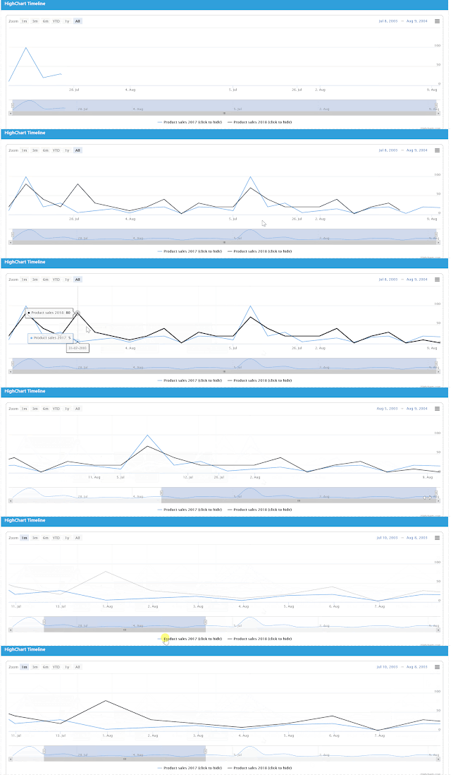
Add a time-series chart to your APEX app - Part 3 of the HighChart Series

Image
Add a time-series chart to your APEX app using HighCharts and JQuery.  This is the third in the series of blog posts showing you how to add HighCharts to your APEX application. This is the most useful of the HighCharts in the series so far, easily turn your date data into an animated time series chart with a couple of lines of JavaScript Demo The chart reads the data points from an Interactive Report on the page. Create the Interactive Region with static ID  IR_STATIC_ID  using the following SQL source; select   TO_DATE ( '2003/07/09' ,  'yyyy/mm/dd' )  as   VALUE_1 ,  10   as   VALUE_2 ,  20   as   VALUE_3   from   DUAL UNION select   TO_DATE ( '2003/07/11' ,  'yyyy/mm/dd' )  as   VALUE_1 ,  20   as   VALUE_2 ,  40   as   VALUE_3   from   DUAL UNION select   TO_DATE ( '2003/07/13' ,  'yyyy/mm/dd' )  as   VALUE_1 ,  30   as ...

Add a timeline diagram chart to your APEX app - Part 2 of the HighChart Series

Image
How to add a timeline diagram chart to your APEX app using HighCharts and JQuery.  This is the second in the series of blog posts showing you how to add HighCharts to your APEX application. Demo I have been using HighCharts in my web apps for a number of years and in my opinion its the best charting JavaScript library out there, its free to use for non-commercial use, robust, well documented, mobile friendly and a great addition to your APEX app.   I work for the University of Glasgow and the next project I am starting is an APEX project where staff members apply for academic promotion. There are many stages to the application process, manager approval, board of review, college review, etc.  A timeline diagram displaying the process to the users will be ideal.  This is how I will do it. As an aside, for American readers  this   is a fascinating story I have recently learned about the University.  James McCune Smith born a slave and the first Afric...

Add a DumbBell chart to your APEX app - Part 1 of the HighChart Series

Image
How to add a DumbBell chart to your APEX app using HighCharts and JQuery.  This is the first in the series of blog posts showing you how to add HighCharts to your APEX application. Demo I have been using HighCharts in my web apps for a number of years and in my opinion its the best charting JavaScript library out there, its free to use for non-commercial use, robust, well documented, mobile friendly and a great addition to your APEX app.   The chart reads the data points from an Interactive Report. Create an Interactive Region with static ID IR_STATIC_ID  using the following SQL source; select   'Australie'   as   VALUE_1 ,  60   as   VALUE_2 ,  70   as   VALUE_3   from   DUAL UNION select   'New Zealand'   as   VALUE_1 ,  70   as   VALUE_2 ,  80   as   VALUE_3   from   DUAL UNION select   'Scotland'   as   VALUE_1 ,  80   as ...

Highlight min and max column values in an Interactive Report

Image
Highlight maximum and minimum column values in an Interactive Report (or grid) with a couple of lines of JavaScript and CSS. Demo Create an Interactive Report region (static ID  IR_STATIC_ID) with the following source SQL; select   'Product 1'   as   PRODUCT ,  100   as   VALUE_1 ,  200   as   VALUE_2 ,  121   as   VALUE_3   from   DUAL UNION select   'Product 2'   as   PRODUCT ,  103   as   VALUE_1 ,  140   as   VALUE_2 ,  99   as   VALUE_3   from   DUAL UNION select   'Product 3'   as   PRODUCT ,  1   as   VALUE_1 ,  2   as   VALUE_2 ,  120   as   VALUE_3   from   DUAL UNION select   'Product 4'   as   PRODUCT ,  10   as   VALUE_1 ,  7   as   VALUE_2 ,  124   as   VALUE_3   from   DUA...

Popular posts from this blog

Oracle APEX Interactive Grid colour cells based on a condition using JavaScript and CSS

Add a timeline diagram chart to your APEX app - Part 2 of the HighChart Series

How to send an email from your ORACLE APEX app